client Roku HQ
project HQ campus, two buildings + skybridge
scope Environmental Graphics, Experiential Installations
complete 2023
project role Design Director
client YouTube
project HQ Lobby
scope Environmental Graphics, Signage, Experiential Installations
complete 2018
project role Art Director
recognition 2019 SEGD Global Design Merit Award
The new lobby design streamlines circulation and creates spaces for people to both experience the digital installation and find solace for work. A series of floor “medallions” are spread throughout the lobby, encouraging visitors to interact with the digital installation.
client Google
project Redwood City campus, three five story buildings
scope Environmental Graphics, Signage & Wayfinding, Art Installations, Experiential Installations
complete 2018
project role Art Director
The concept story was to honor the trailblazers, innovators, and creators throughout California’s history. The goal for the lobby was to introduce each of the trailblazer subthemes of art, makers, culture, innovation, and agriculture as a first expression of the type of artwork experienced throughout the entirety of the building.
client Google
project two workplace building campus
scope Environmental Graphics, Art Installations
complete 2017
recognition 2017 Print Regional Design Annual Magazine
Exploring advertising billboards as inspiration, the graphic billboard as a metaphor pays tribute to the tech client as the pioneering force in online advertising. American idioms were used to illustrate phrases such as “When Life Gives you Lemons” and “What you see is what you get” into whimsical collages throughout the building. 770 individual artwork panels were produced and curated into 30 installations.
Materiality, layering and transparency were studied in order to develop distinct visual compositions, then curated with architectural design elements. Art was direct printed onto Plywood and OSB in order to provide an honest and raw beauty in billboard construction materials then finished with paint dipped fields of color. Juxtaposing a delicate fabric canvas provides the structures with transparency, alluding to how aged billboards are often missing panels. Feature movable locations are easily rearranged to encourage manipulation of compositions.
recognition Best of 2014 promo featured in FPO Underconsideration
Inspired by the magic of Willie Wonka and winning the elusive golden ticket, self promotional Best of 2014 Award aimed to deliver a smile to each lucky recipient. This whimsical award has a hint of gold foil wrapped with blind embossing.
client LinkedIn
project 4 story workplace building
scope Inbug installation, Environmental Graphics, Signage
complete 2019
Each graphic artwork in the building follows a common thread story represented by one of three modes of communication and collaboration: analogue, human and digital. The artwork and wayfinding used a gradient color scheme per floor.
LinkedIn’s three-dimensional “InBug” is composed from a blend of common and sustainable materials—blue cords, threaded frames, acrylics and painted woods—the combined layers represent the common thread story represented throughout the building.
“It’s all about the process” was a brand message showcased to reinforce LinkedIn’s culture. The layers of different typography enforce the idea of process.
client Shashi Group
project Brand Identity
scope Brand Identity, Brand Guidelines, Collateral, Interior Wayfinding, Garage Wayfinding
complete 2019
project role Art Director
Boutique hotel appealing to the world traveler in Mountain View. The brand identity was realized through brand guidelines, collateral, garage wayfinding and interior wayfinding.
client Western Office
project Rebrand Identity
client Cal Poly
project Student Housing
scope Environmental Graphic Wayfinding Murals
complete 2018
project role Art Director
recognition 2019 SEGD Global Design Merit Award
2019 Core 77 Design Awards
2019 IIDA Northern California Honor Awards
A deep connection to place comes from a partnership with the local Northern Chumash tribe, yak titʸu titʸu yak tiłhini, to provide direction for creating unique wayfinding environmental murals for each of the residence halls. The stories centered around the surrounding landscape of seven yak titʸu titʸu yak tiłhini villages along the Central Coast; focusing on their deep-rooted ties to the land by celebrating local flora and fauna.
project firm portfolio book
completion 2012
recognition honored in 2012 by Smithsonian Cooper-Hewitt National Design Award
client Google
project Environmental Graphics
complete 2017
Tron themed game room for Google. Reflective vinyl wrapped the surfaces with the light crashed into the column.
client Google
project Cafe sign
complete 2017
The sign design concept was inspired by the name Java Corner and embellished corners as a design feature.
client Reboot Stories
project identity & book design
completed 2014
Formerly DIY Days, worked with Reboot Stories to help them reposition the 3-day conference and rebrand the identity as Learn Do Share.
After rebranding Learn Do Share, the task of designing the LA booksprint #5 to reflect the new identity and capture the 3-day LA event was a fluid process.
project brochure
completion 2010
To describe the spectra of work, award-winning projects, and great photography, a large tabloid sized format was chosen for the firm’s promotional brochure. It allowed wide angled and detailed imagery to coexist.
client Google
project Environmental Graphics
complete 2016
The graphic approach was based on soft, natural patterns and color palettes that were incorporated into acoustic and architectural features. We utilized biophilic design to provide an environment that felt natural in the space, connecting outside redwoods
and plant life into the workspace.
client Haworth
architect Clive Wilkinson Architects
project Chicago NeoCon showroom
scope Environmental graphics
completion 2011
The story for Haworth's 2011 NeoCon showroom embraced design freedom through their furniture solutions. This was displayed through an evolution of workplace settings and expressed through colored spacital zones. The columns became graphic wayfinding devices to tell a spacial story.
client Macquarie Group
architect Clive Wilkinson Architects
project environmental graphics
completed 2011
Stacked shipping container grid wall graphic concept for the trader bank group —
connecting the office space with the harbor.
project simple solutions poster
completion 2009
recognition 2009 Print Regional Design Annual Magazine
2010 Digital Imaging with Messages book
client City of Santa Monica Cultural Affairs Division
project Jazz on the Lawn event series
completed 2017 & 2015
client AIA LA
project brochure
completion 2013
AIA Los Angeles utilizes their Advocacy Platform brochure as their conversation piece with key city council members to weigh their 10 point plan for Los Angeles. The brochure anchored the non-profits goals with hierarchy and bold typography through the 10 points.
The holiday coaster is a result of the following ingredients: love for letterpress printing + love for holiday music. A homage to the Nutcracker with annual holiday greetings highlights the beloved Sugar Plum Fairies’ sequence.
Domestic and international packaging designs for various housewares products. Each product went through a development process for art direction of photography, package diecut and illustrated infographics to highlight the key selling features.
client Lucky Brand
Sketches and studies from pen to cyanotypes, collage and silkscreening.
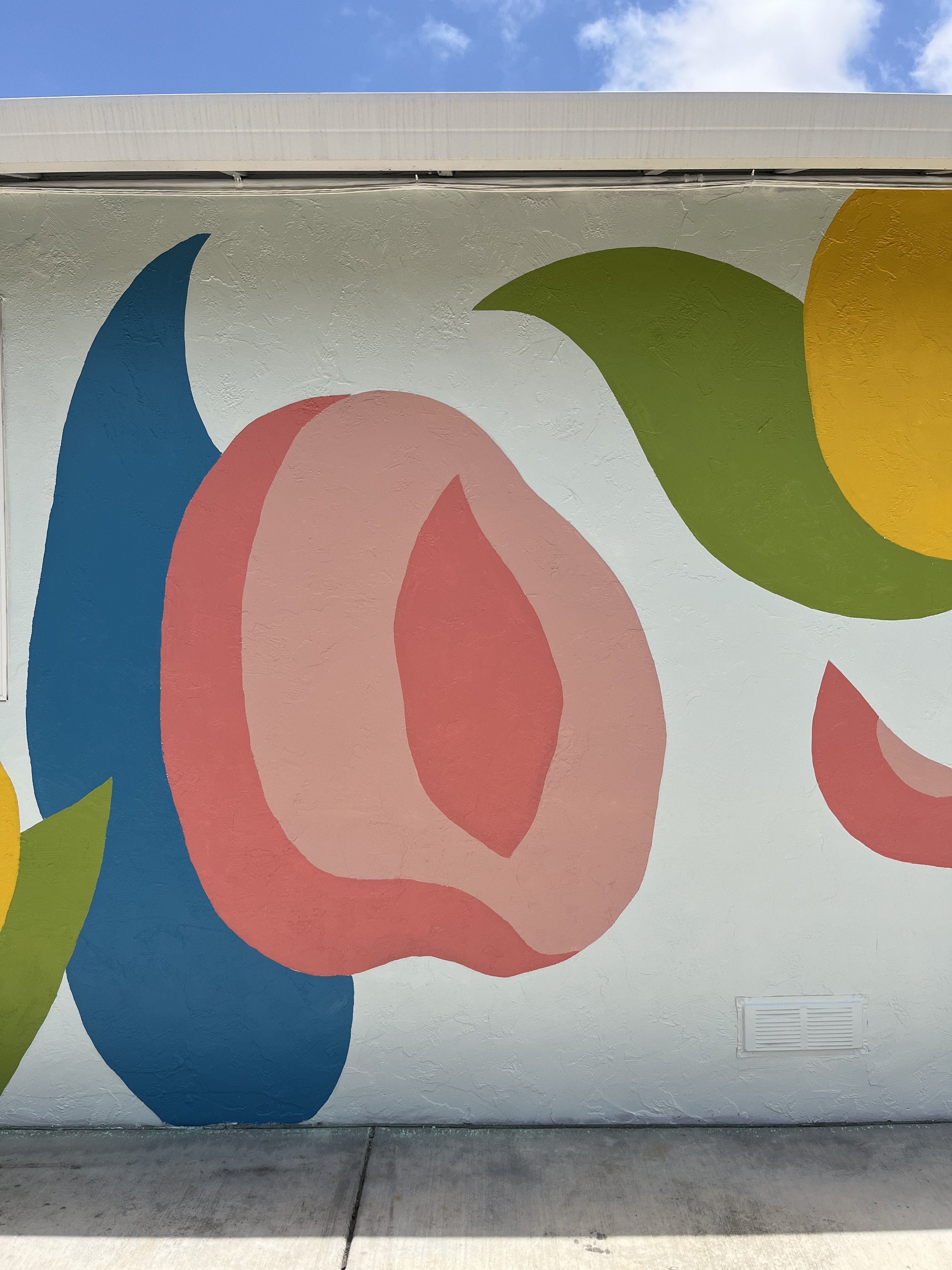
project Project Color Corp mural
scope mural
complete 2023
Mural collaboration project with Project Color Corps for a youth residence.
The love promo was sent to clients and the community to share about something they love and received a great response in return.